nomad electric

Stagnant made advancing

What the company does
Nomad Electric delivers comprehensive utility-scale renewable energy solutions, pioneering solar, wind, and hybrid power plant technologies through EPC services, O&M operations, and proprietary SCADA platform development.

What designers did
We implemented a complete brand transformation using our "unselling" methodology, repositioning Nomad Electric from a conventional energy contractor to an advancement-driven technology pioneer. The strategic redefinition centered on the concept of "never stop" – continuous energy, innovation, and operations – while developing a sophisticated identity system that speaks to engineers rather than boardroom executives.

Verbal Identity

Naming

nomad electric

Brand Anthem
Tagline

never stop

Supportive Copy

nomad electric® delivers comprehensive utility-scale renewable energy solutions, pioneering solar, wind, and hybrid power plant technologies.

our expertise drives the complete project lifecycle, from turnkey epc deployment to ai-powered o&m services. at the core of our operations is our proprietary scada platform, nomad nx™scada, an engineof our commitment to next-gen energy solutions.

we advance the future with the power of forever.

What's interesting

The need for audience realignment came up at the very end of the multi-day briefing process, when the CEO managed to find time to visit us in the office, and we could talk in a relaxed manner over coffee. He said that the brand isn't really to attract new clients, as deals are done at events. The real issue is attracting and hiring specialists, who are limited and mostly already taken.

What's interesting

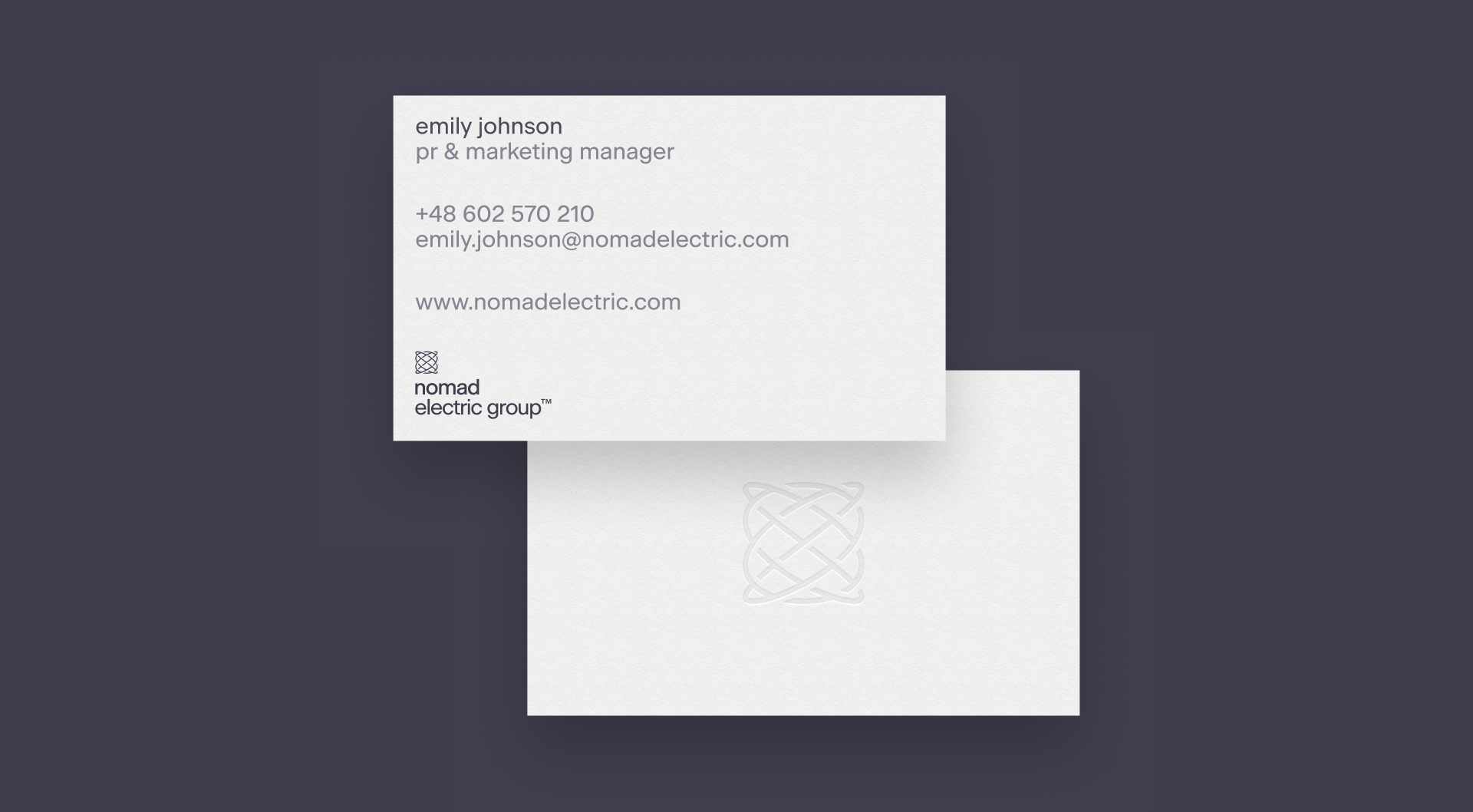
The CEO was really patient with us when we completely reconstructed the image of his company, and his final red line was drawn when we wanted to write people's names in lowercase.

What's interesting

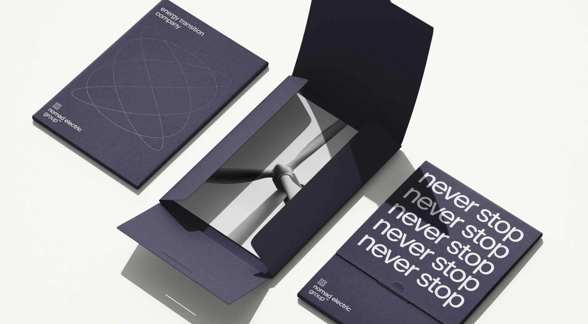
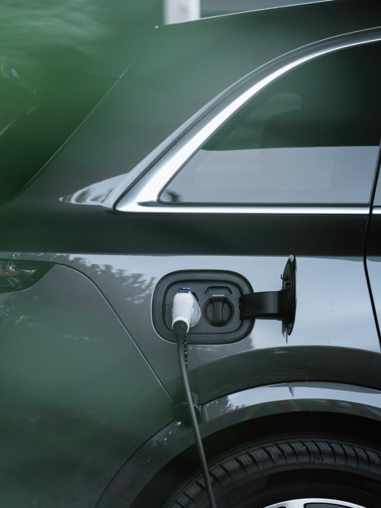
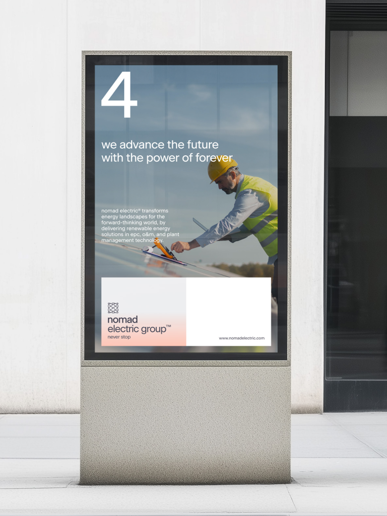
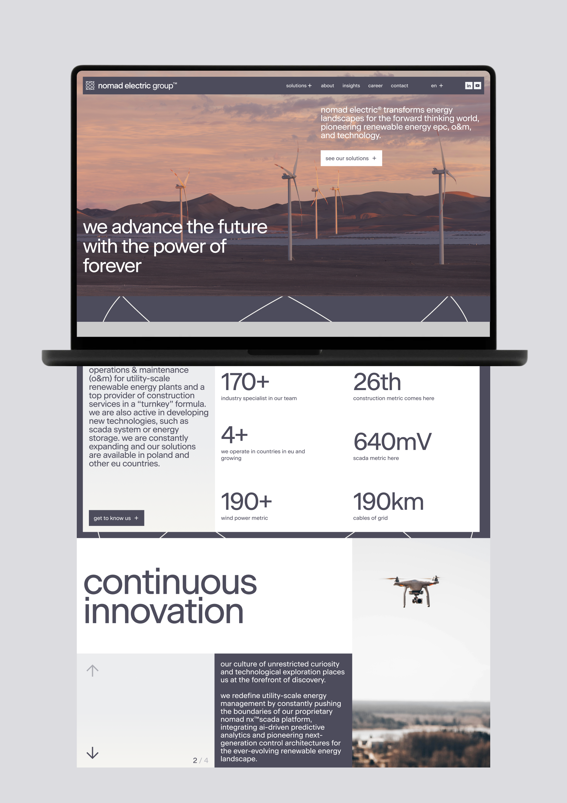
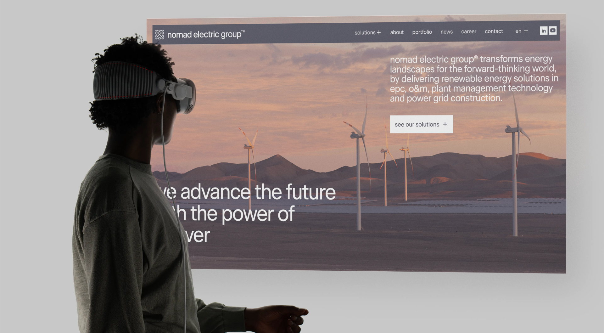
The copy "the power of forever" actually originated from a different green energy project years ago, which didn't take off. Rather than abandon it, we kept the phrase in our back pocket until we found the right fit - which turned out to be Nomad Electric.

What's interesting

During each meeting at the client's HQ we were greeted with delicious donuts and other sweets, and we encouraged all future clients to do the same.

What's interesting

After the board accepted the brand identity, management asked us to present the brand to the rest of the company. At the end of the presentation to the team, one employee realised what the new logo was, stood up indignantly and shouted, 'What the hell is this! Can you people even see it?!' The CEO thanked us, ended the meeting, and then implemented the brand.

Designer’s insight

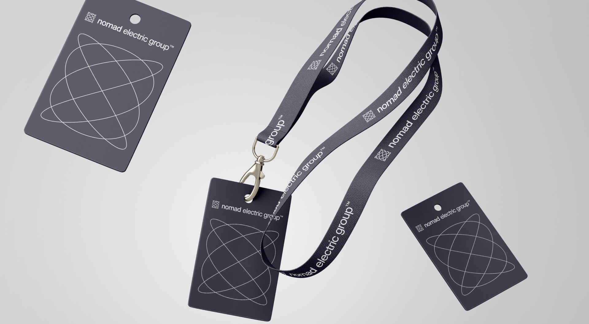
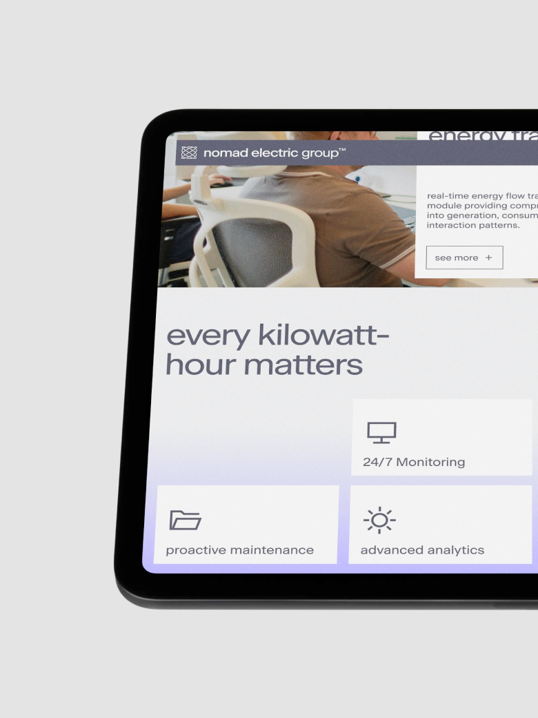
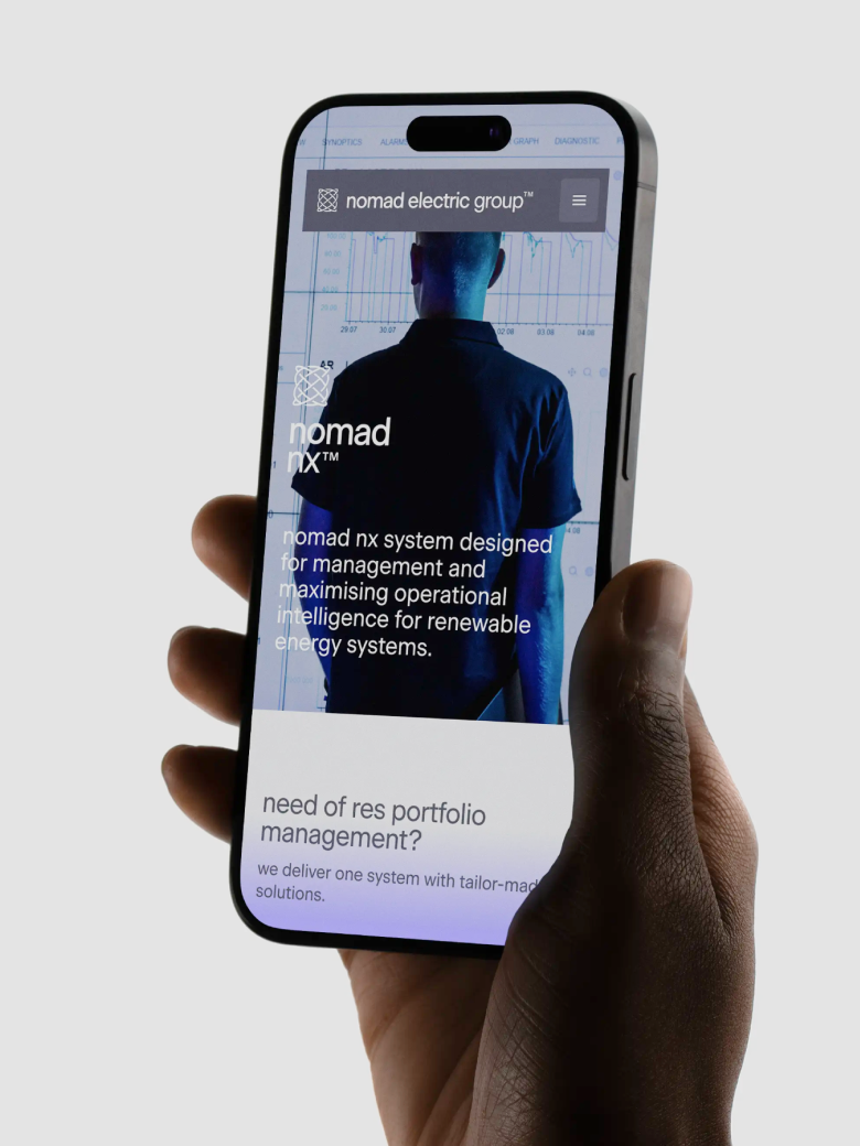
“I'd been wanting to create a brand in lowercase for ages and finally managed it. Not completely, though, because names and surnames are capitalised, but mostly I pulled it off. Obviously this approach had to make sense, and here it does, because we're presenting a somewhat rebellious tech company where the idea is based on removing barriers, and capital letters are barriers to me.”

— Mariusz Ruciński,
Character + Voice Lead

Designer’s insight

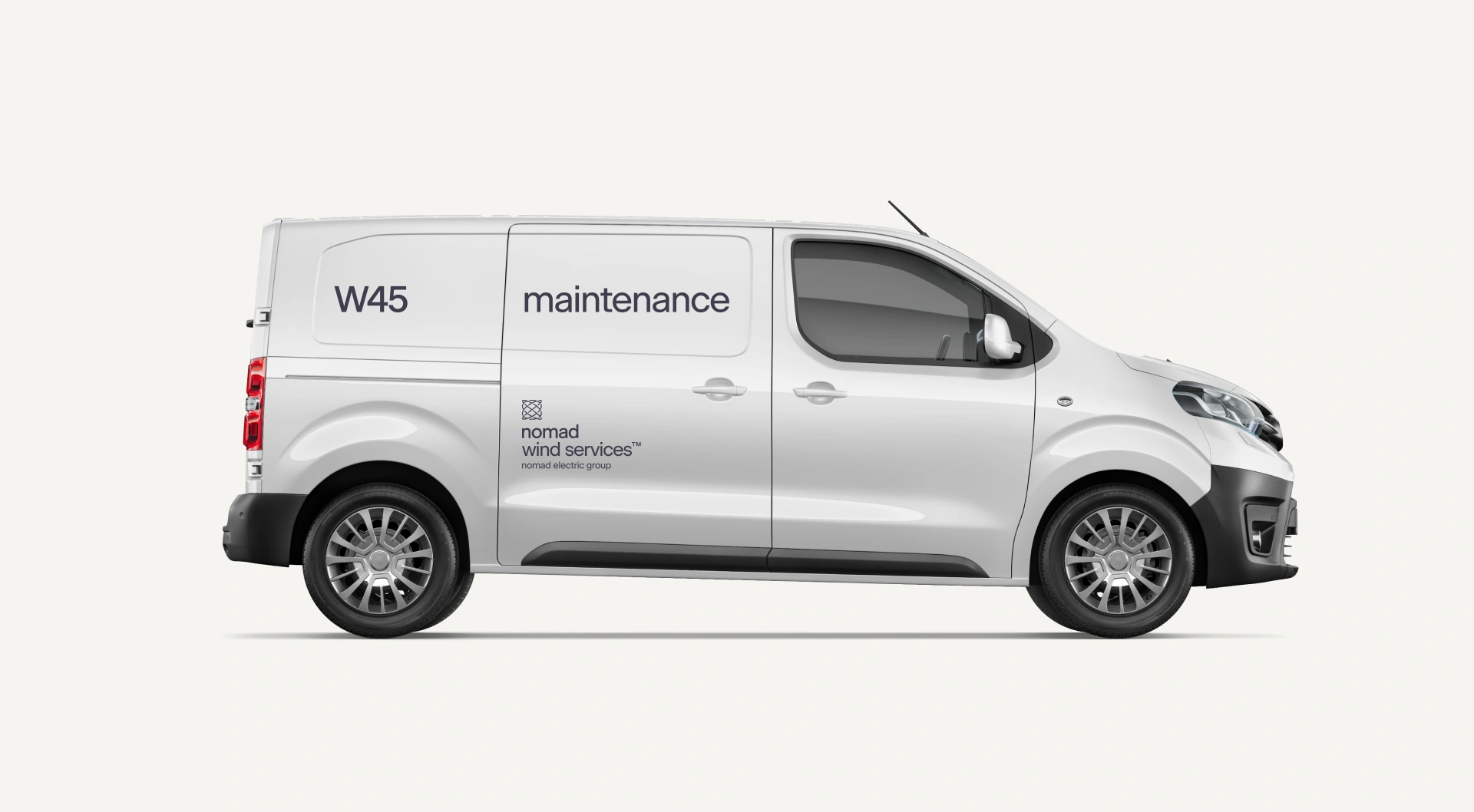
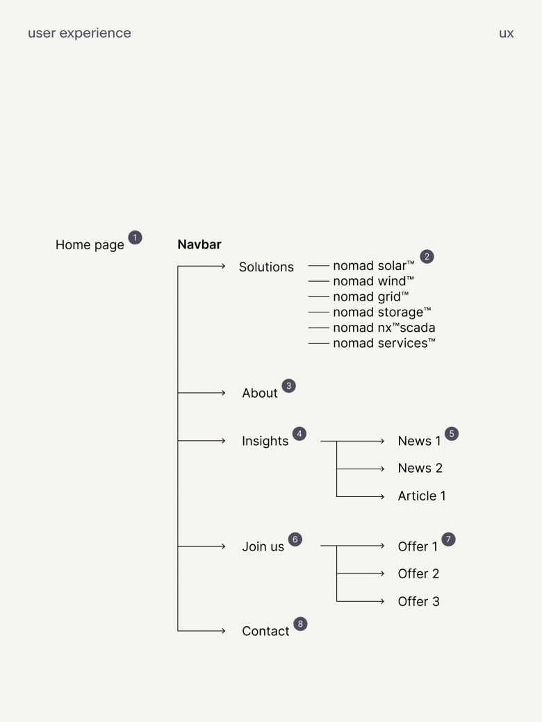
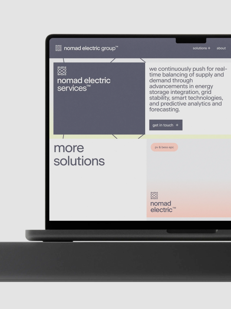
“When designing brand identity for Nomad, I had to keep in mind all sub-companies and individual services that went under the parent-brand umbrella. This opened up new opportunities and interesting challenges in how to treat and divide the communication system in a way that feels cohesive, so that every entity could be presented on its own, with equal impact. To divide the sub-brands, we used colour coding and a modular approach for the logo. Colours are inspired by glowing neon halos, resembling energy sources. The logo is constructed in a way that makes it easy to add new entities, as the company grows and branches out into new territories.”

—Wojciech Omiotek,
Senior Graphic Designer

Some people say things you'd never believe

Summary

What is the company's profile

Nomad Electric entered the rebranding process as a technically proficient but strategically fragmented renewable energy company. Despite strong engineering capabilities, the company lacked cohesive brand positioning that differentiated them in an increasingly crowded market.

Their previous brand positioning relied heavily on generic sustainability messaging and corporate respectability, failing to connect with their primary audience of utility engineers and energy project developers. The company's diverse service offerings – from solar and wind installations to grid integration and monitoring systems – appeared disconnected rather than synergistic.

Most critically, Nomad Electric's genuine innovation in areas like AI-powered predictive analytics and next-generation control architectures was buried under conventional industry language that failed to communicate their forward-thinking approach.

What is the extent of tasks

A        Brand Personality (Market Landscape Analysis, Current Brand Analysis, Industry Analysis, Corporate Culture Analysis, Company Analysis, Product/Service Analysis, The Big Idea, Brand Positioning, Brand Strategy, Brand Story, Brand Character).

B        Brand Language (Domain Naming, Slogans/Claims, Key Messaging, Descriptor, Tagline, Brand Tone & Voice, Brand, Brand Statement, Brand Storytelling, Brand Anthem, Brand Sales Writing).

C        Brand Appearance (Brand Visual Identity, Visual Needs Analysis, Brand's Visual Expression Concept, Information Architecture, Functional Design Systems, Brand Art Direction, Logomark, Logotype, Iconography, Brand Visual Architecture, Brand Color Palette, Brand Typography, Brand Graphics & Patterns, Imagery & Photography, Branding Guidelines, Grids, Brand Collateral, Brand Signage, Wayfinding, Packaging Design, Editorial, Stationary, Web & Digital Design, UX/UI Design).

What are the objectives

A        Market Differentiation: Establish clear competitive separation in a commoditized renewable energy market by positioning Nomad Electric as a technology-driven advancement pioneer rather than conventional energy services provider.

B        Audience Realignment: Shift communication strategy from corporate executives to engineering decision-makers who actually evaluate and purchase utility-scale energy solutions, using technical authenticity over boardroom polish, and who may be interested in joining Nomad Electric ranks.

C        Brand Unification: Create cohesive identity architecture that consolidates multiple service offerings and subsidiary brands under a single strategic framework while maintaining flexibility for future expansion.

How we achieved the objectives

A        Strategic Redefinition Through "Never Stop" Philosophy: Rather than positioning renewable energy as a destination, we framed it as a continuous process of advancement befitting the brand’s name. The three pillars of continuous energy, innovation, and operations directly addressed industry challenges while highlighting Nomad Electric's solutions, resonating with engineering audiences who understand that energy systems require constant optimization.

B        Engineer-First Communication Development: All messaging prioritized technical accuracy and engineering logic over corporate polish. The brand voice emphasises precision and unconventionality, using industry-specific terminology while explaining complex concepts clearly. This approach built immediate credibility with technical decision-makers who make actual purchasing decisions, but who also might want to join Nomad Electric’s ranks.

C        Integrated Visual System with Technical Metaphors: The identity system employs mathematical and electrical metaphors that engineers intuitively understand. The oscilloscope-inspired logo represents both harmonic motion and infinite advancement, while the naming architecture operates as a logical framework accommodating new technologies through consistent nomenclature supported by the proprietary nomad nx™scada platform as technological differentiator.

Authors

Brand Identity Concept + Positioning
Mariusz Ruciński

Verbal Identity + Copywriting
Mariusz Ruciński

Visual Identity + Art Direction
Wojciech Omiotek

Adaptation Design
Filip Frydel

UX
Katarzyna Bazylczyk

UI
Gabriela Baka, Adrian Dziama

Animations
Oswald Bednarski, Kseniia Chelpan

Operational Management
Patrycja Stefaniak, Grzegorz Derlukiewicz

Results

We use cookies to analyze traffic and gain a better understanding of our audience. Learn more
Strategy
/
Verbal Design
/
Naming
/
Visual Design
/
Branding
/
Photography
/
UI
/
UX
/
We use cookies to analyze traffic and gain a better understanding of our audience. Learn more