Hugup

Sacred made sensual

What the company does
The company designs and produces maternity support bodysuits designed for the wellness purpose of preventing pregnancy-related health complications.

What designers did
Designers helped position Hugup as a lifestyle brand with an experimental, yet warm and welcoming verbal and visual identity.

Verbal Identity

Naming
Brand Anthem
Tagline
Supportive Copy

{ fear~uncertainty~maturity~focus~restraint~outcry~perfection

carrying=caring=carrying=caring=carrying=caring=carrying=caring=carrying

/////strength/////breeds/////strength/////breeds/////strength/////breeds/////strength////

{            big*bang*belly*button            }

w~omb

What's interesting

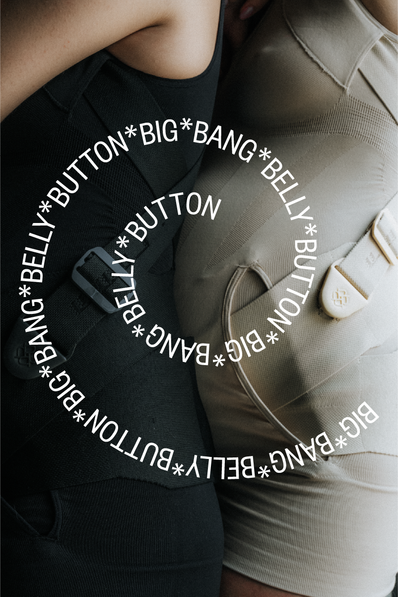
The company's founder developed the product based on her own challenging pregnancy experiences, which resulted in multiple operations and ongoing health issues.

What's interesting

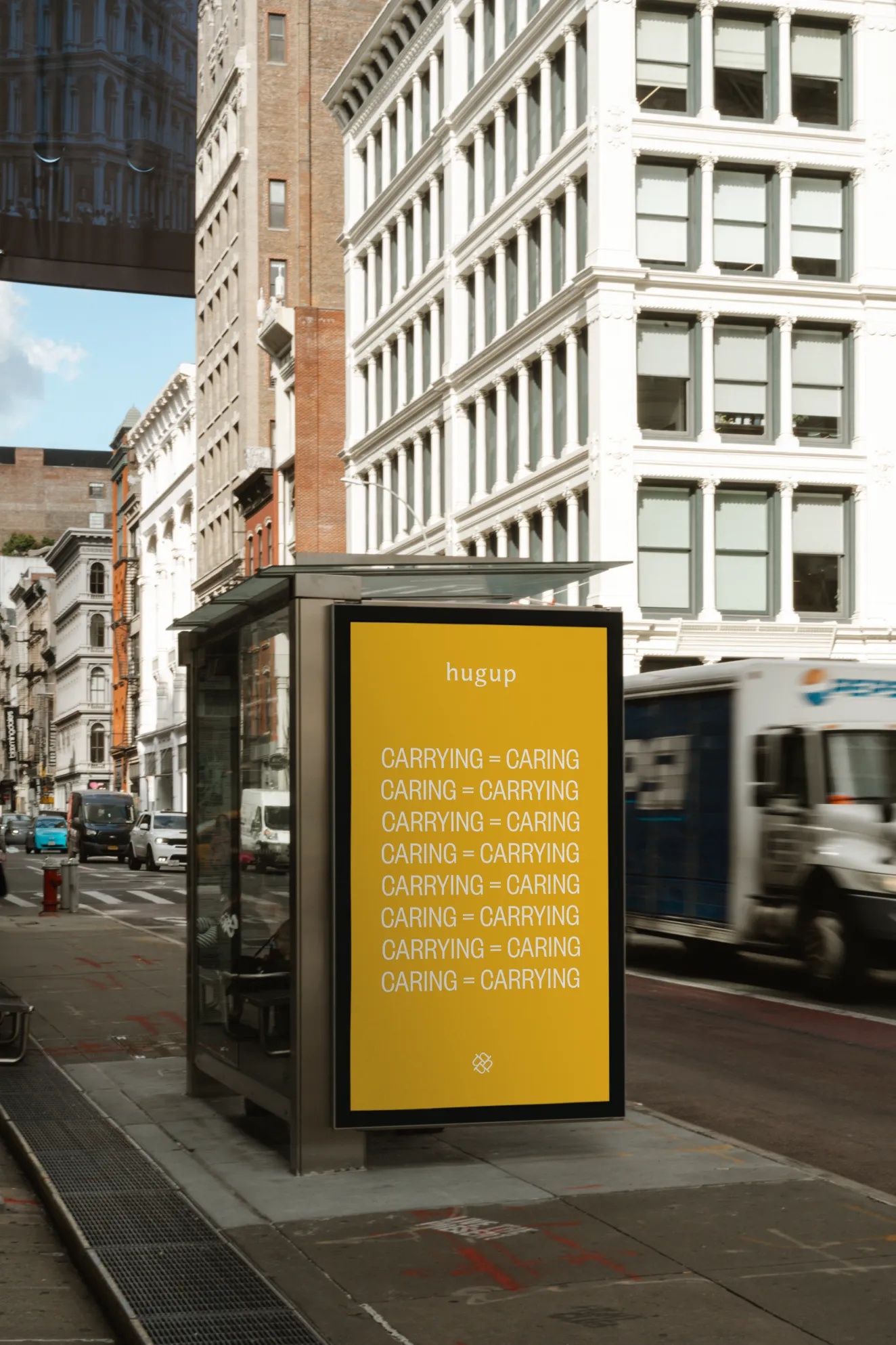
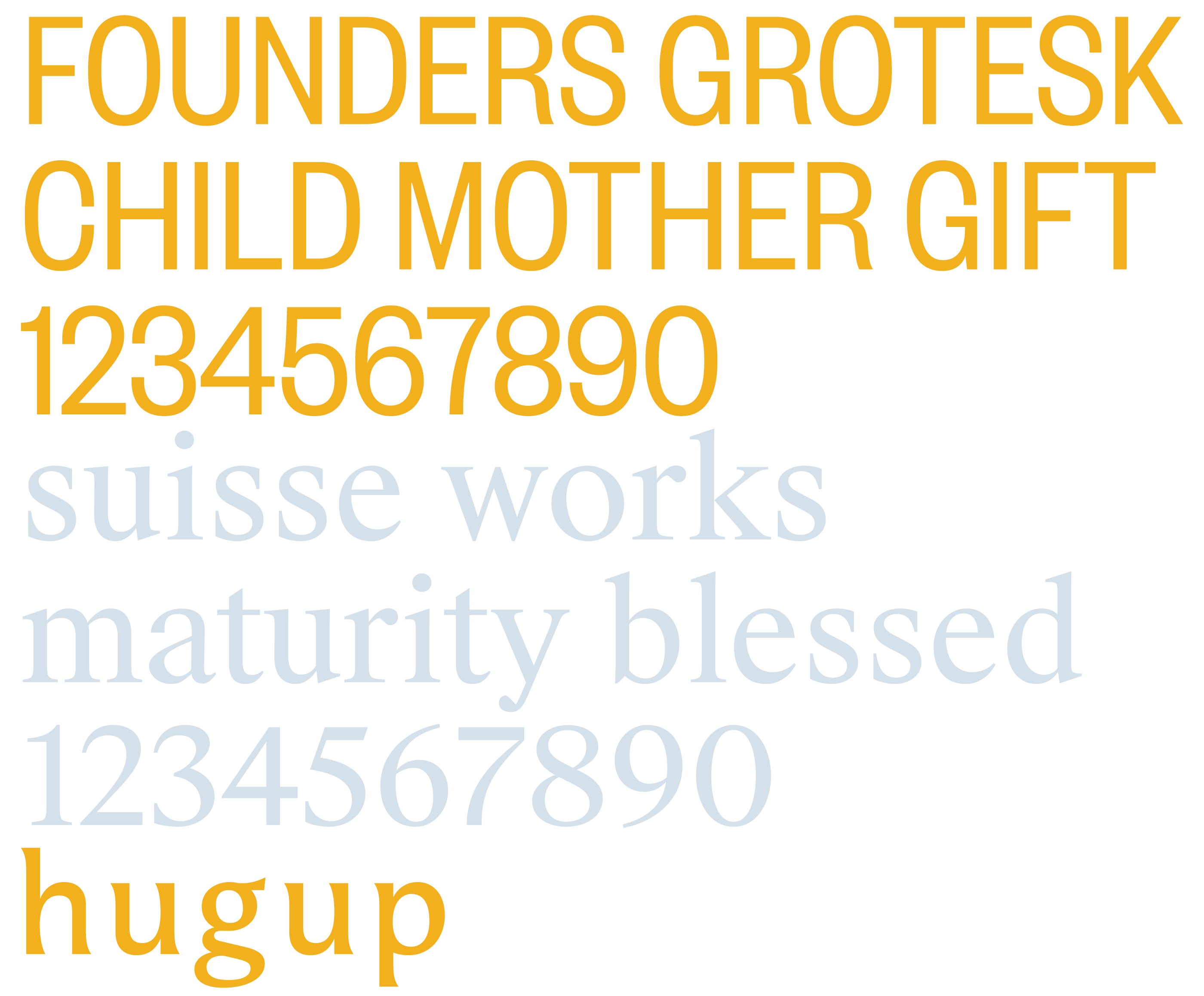
The client's team didn't expect the experimental approach to verbal design, framing it as an artistic endeavour. But they were more than happy to implement it as their brand language.

What's interesting

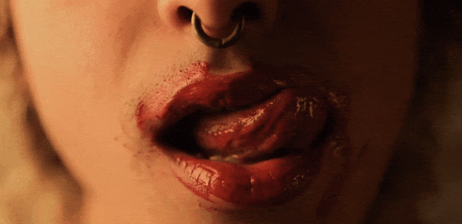
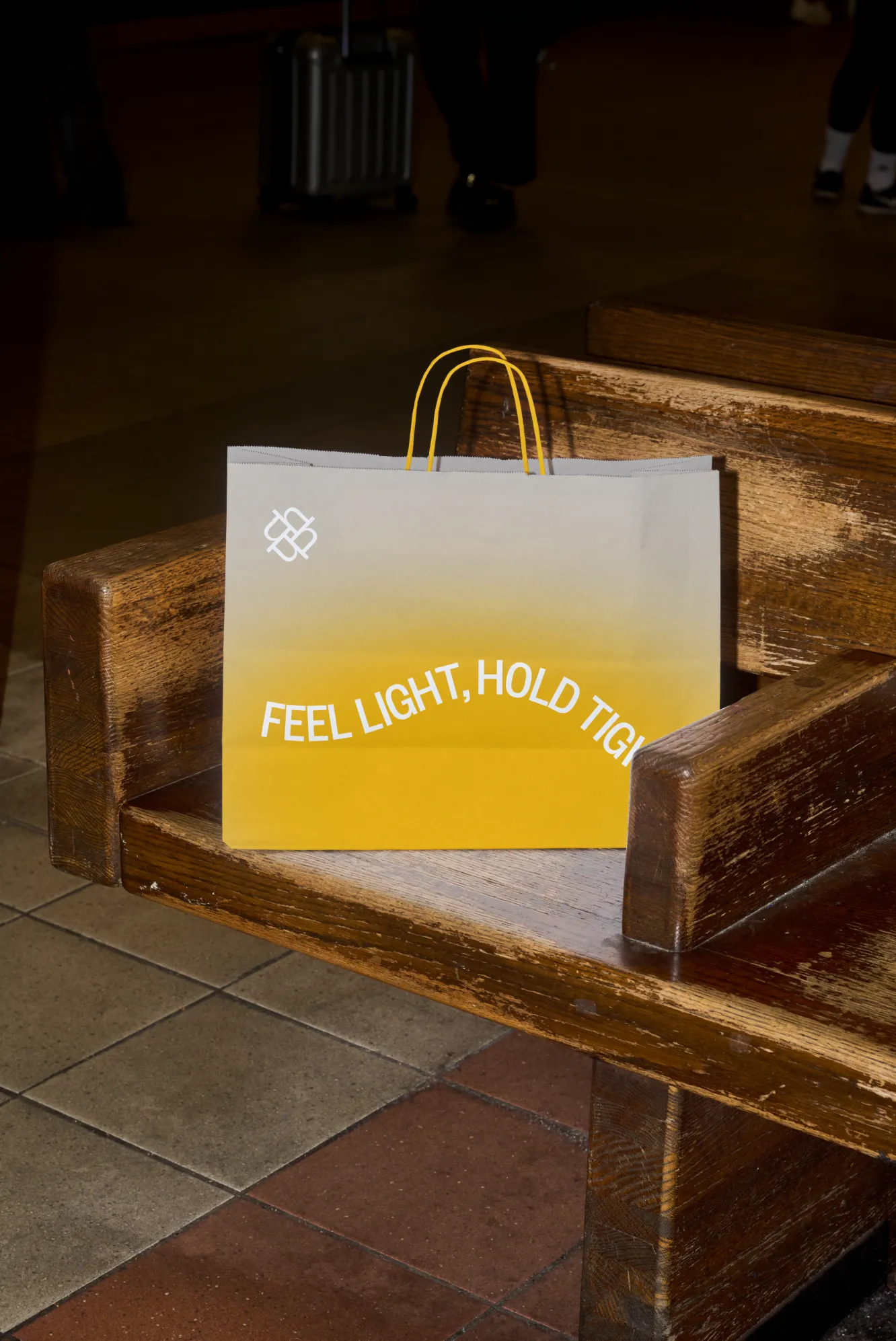
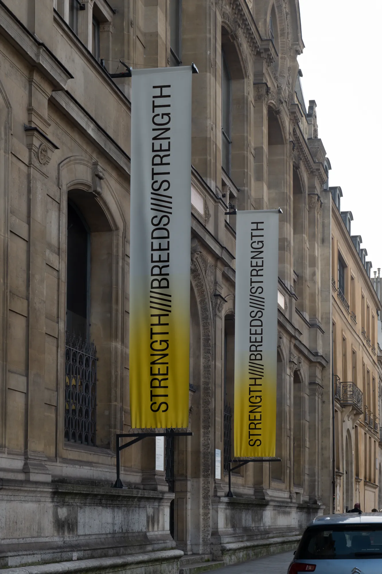
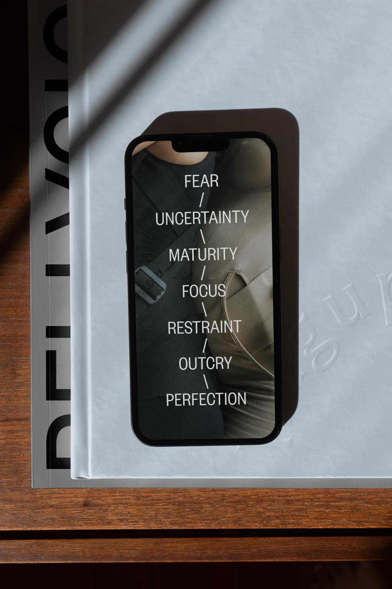
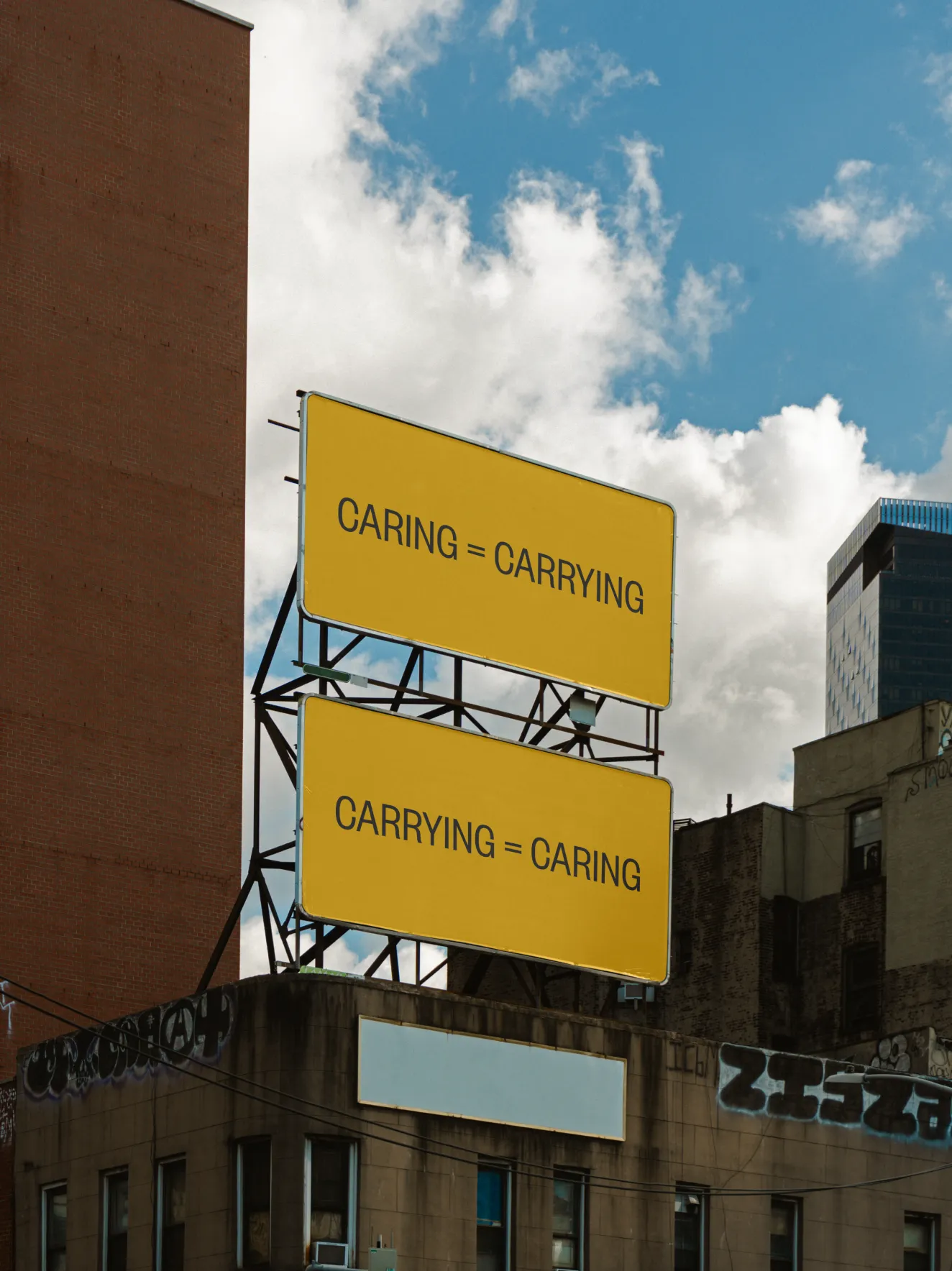
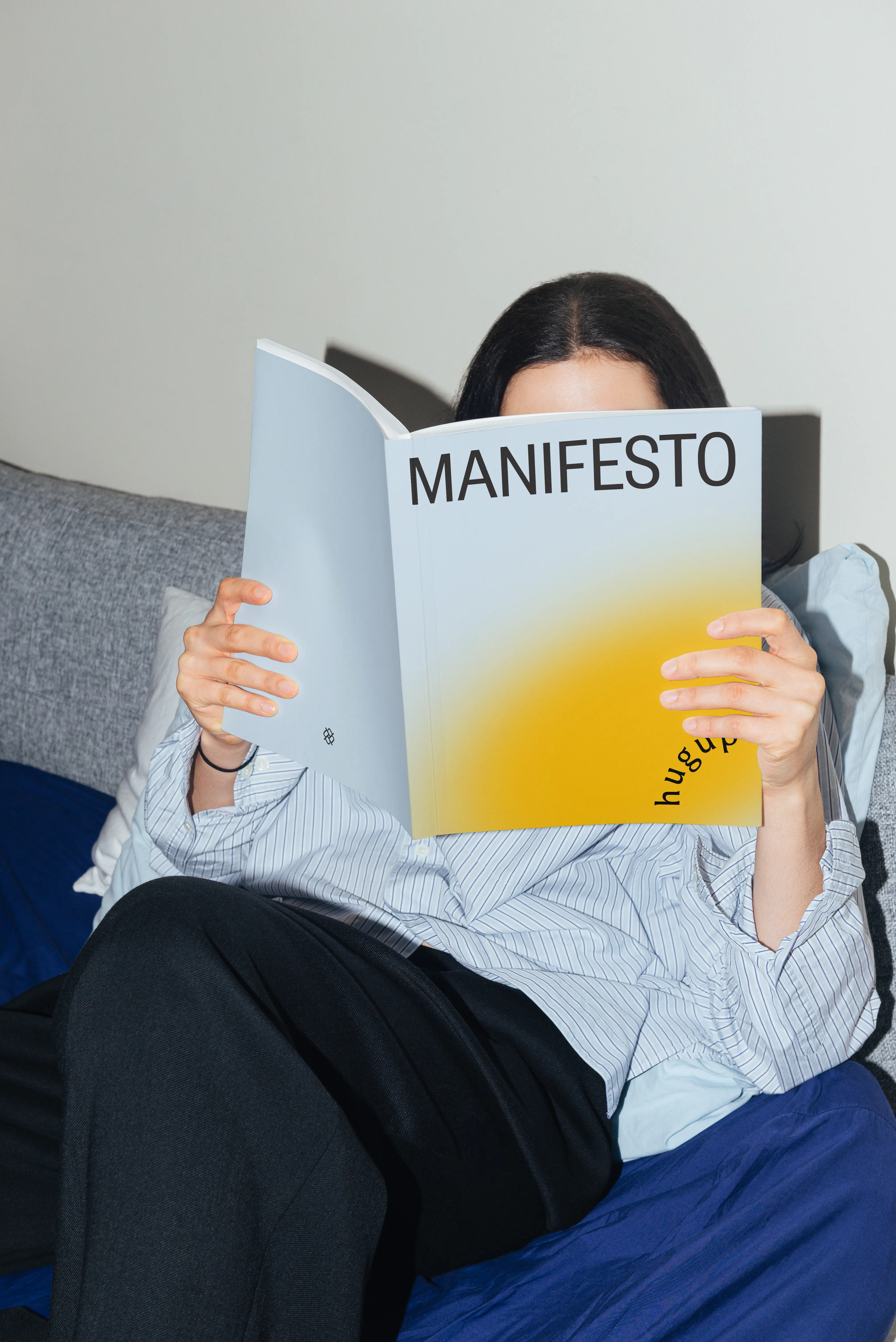
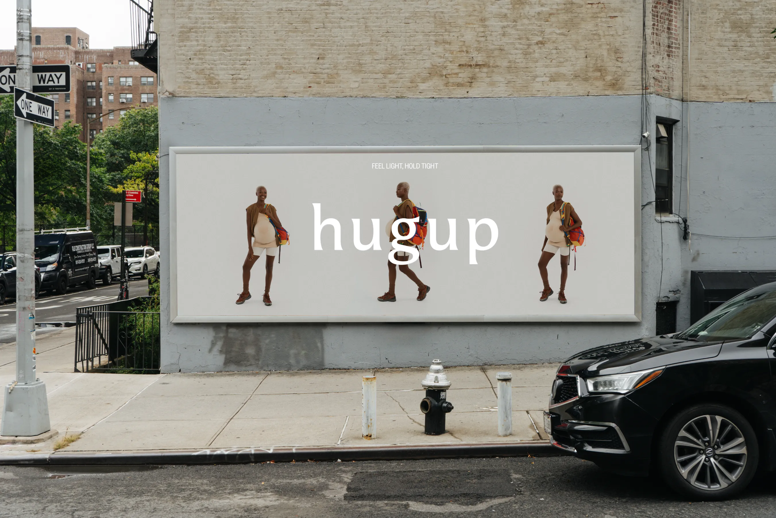
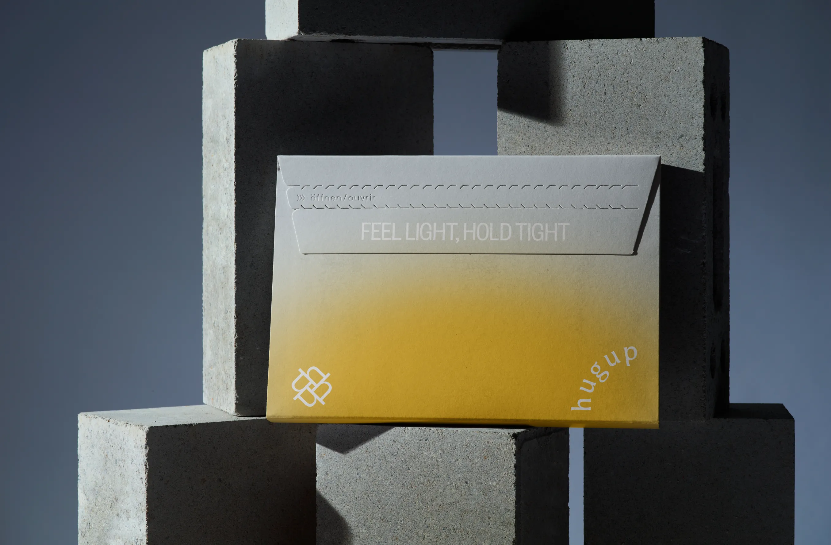
Contrary to many women-centric products, we positioned the brand as a manifesto celebrating pregnancy as a lifestyle event and femininity itself, in contrast to the common social stigma that confines women to the "blessed state" and burdens them with the artificial responsibility of "holy motherhood".

Designer’s insight

“I often smiled, thinking that a childless guy was tasked with grasping the essence of a pregnancy product. Quite a task. And yet it became very close to me. I became almost fiercely protective of the idea behind the project, championing the rights of a soon-to-be mother to live her life fully and freely without a social burden or guilt. Well… It affected me for a time. I guess this happens when you care a bit too much.”

— Mariusz Ruciński,
Character & Voice Lead
“Working on Hugup took me somewhere completely new – well outside my usual creative comfort zone. Maternity and the deeply intimate transformation that comes with pregnancy – these weren't themes I'd ever really explored before. I knew from the start that this project would need real design sensitivity, but also that I'd have to open myself up to unfamiliar emotional and symbolic territory. Hugup became this exercise in empathy through design, trying to balance tenderness with strength. It pushed me to design with genuine care, while avoiding anything too sentimental.”

— Rokas Sutkaitis,
Senior Graphic Designer

Some people say things you'd never believe

Summary

What is the company's profile

Hugup is innovative supportwear designed to keep expecting mothers comfortable, confident, and moving freely throughout their pregnancy. Founded by a mother who experienced health difficulties during her own pregnancy, Hugup was born from firsthand understanding of the challenges women face during this transformative time. As a women-led company dedicated to women's health, Hugup is committed to developing solutions that truly serve the needs of expecting mothers.

What is the extent of tasks

A        Brand Personality (Market Landscape Analysis, Current Brand Analysis, Industry Analysis, Corporate Culture Analysis, Company Analysis, Product/Service Analysis, The Big Idea, Brand Positioning, Brand Strategy, Brand Story, Brand Character).

B        Brand Language (Domain Naming, Slogans/Claims, Key Messaging, Descriptor, Tagline, Brand Tone & Voice, Brand, Brand Statement, Brand Storytelling, Brand Anthem, Brand Sales Writing).

c        Brand Appearance (Brand Visual Identity, Visual Needs Analysis, Brand's Visual Expression Concept, Information Architecture, Functional Design Systems, Brand Art Direction, Logomark, Logotype, Iconography, Brand Visual Architecture, Brand Color Palette, Brand Typography, Brand Graphics & Patterns, Imagery & Photography, Branding Guidelines, Grids, Brand Collateral, Brand Signage, Wayfinding, Packaging Design, Editorial, Stationary, Web & Digital Design, UX/UI Design).

What are the objectives

A        To create a positioning approach that separates the new brand from its competitors and represents values of its founders.

B        To craft brand language that communicates the brand message clearly.

C        To develop a complete visual identity system that aligns with the positioning and verbal approach.

How we achieved the objectives

ad A        Hugup successfully repositioned pregnancy from societal burden to lifestyle celebration by challenging the "blessed state" narrative that traditionally confines women. The brand deliberately rejected the artificial responsibility of "holy motherhood," instead positioning pregnancy as an empowering period worthy of confidence and freedom rather than limitation and obligation.
The positioning strategy centered on attractive femininity that defied conventional pregnancy marketing. While most competitors reinforced social expectations of modest, grateful motherhood, Hugup embraced sexuality and confidence as natural aspects of pregnancy. This approach transformed orthopedic pregnancy suits from wellness necessity into lifestyle choice, positioning the brand closer to sports and fitness categories than traditional maternity wear.
The rebellion element became central to differentiation. By treating pregnancy taboos as outdated social constructs rather than natural limitations, Hugup positioned itself as a manifesto for modern femininity. The brand communicated that pregnancy should enhance rather than diminish a woman's sense of self, directly challenging the status quo that expects women to minimize their identity during pregnancy.
This positioning created clear emotional differentiation in a market dominated by protective, conservative messaging. Hugup's promise of sexiness, confidence, and relaxation during pregnancy appealed to women who refused to accept societal constraints on their femininity. The sports brand aesthetic reinforced active, empowered pregnancy rather than passive endurance, fundamentally shifting category expectations from accommodation to celebration.

ad B        Hugup's verbal identity successfully merged experimental typography with emotional messaging to create a distinctly visual language that challenges traditional pregnancy communication. The experimental approach transforms words into visual elements while mimicking the texture of the orthopedic suit material, creating tangible connection between brand communication and product experience.
The slash-and-bracket patterns create rhythmic progressions that mirror both pregnancy's emotional journey and the woven texture of the suit fabric. Phrases like "{ fear~uncertainty~maturity~focus~restraint~outcry~perfection" acknowledge the complex psychological landscape of pregnancy while visually echoing the supportive material structure that provides physical comfort.
Repetitive word play reinforces core brand promises through hypnotic mantras that mirror textile patterns. "carrying=caring=carrying=caring" creates linguistic loops that emphasize dual pregnancy support—physical carrying and emotional caring—while the repetitive structure visually references the consistent weave of supportive fabric.
The rhythmic typography in "/////strength/////breeds/////strength/////" communicates empowerment through patterns that feel both meditative and energizing, while visually suggesting the ribbed texture and structural integrity of the orthopedic material. This creates a subconscious association between verbal strength and physical support.
Playful phrases like "big*bang*belly*button" inject humor while the asterisk punctuation mimics fabric texture points, making even irreverent messaging feel connected to the product's tactile qualities. This experimental approach aligns perfectly with Hugup's positioning as a rebellious celebration of pregnancy, creating a distinctive voice that feels confident, contemporary, and physically grounded in the product experience.

ad C        Hugup successfully created an identity that transforms pregnancy branding by embedding the experience itself into the visual language. The dynamic logotype serves as the conceptual foundation, where five letters orbit in circular motion to mirror the cyclical nature of pregnancy and fetal development. This movement directly references birth calendars, with expanding letter spacing that visualizes gestational progression—creating an immediate emotional connection between the brand mark and the user's lived experience.
The logo's dual nature addresses both the emotional and practical aspects of pregnancy support. In motion, it represents growth and transformation; at rest, the half-circle formation suggests the protective embrace of a womb while simultaneously referencing the Hugup device itself. This visual metaphor extends the brand's core promise of support into every touchpoint, creating consistency between product function and brand expression.
The identity system breaks conventional pregnancy aesthetics through playful verbal patterns that inject rebellion and empowerment into a category often dominated by overly precious or clinical approaches. These fluid yet simple patterns maintain scalability across digital and physical applications, ensuring the brand can adapt to various contexts without losing impact or becoming overly complex in execution.
The circular motif becomes a unifying element that "wraps" content throughout the identity system, reinforcing the supportive gesture concept. This creates a cohesive brand world where every element—from packaging that literally hugs products to digital interfaces—communicates care and protection through visual form rather than just messaging.
The result positions Hugup as both empathetic and fashion-forward, striking a balance between emotional resonance and contemporary design sensibility. The identity successfully communicates the brand's core promise through elegant visual metaphors that make abstract concepts like support and empowerment tangible and immediately recognizable. The adaptable system ensures consistent brand expression whether animated or static, creating a vibrant yet practical brand ecosystem that scales across all customer touchpoints.

Authors

Brand Identity Concept + Positioning
Mariusz Ruciński

Verbal Identity + Copywriting
Mariusz Ruciński

Visual Identity + Art Direction
Rokas Sutkaitis

Visual Assistance
Natalia Bilska, Kamila Staniszewska

Illustrations
Joanna Kamosz

Photography
Vlad Baranov

Styling
Magda Zabierzowska

Production
Karolina Pytlakowska, Magda Zabierzowska

Operational Management
Grzegorz Derlukiewicz, Patrycja Stefaniak

Results

We use cookies to analyze traffic and gain a better understanding of our audience. Learn more
Strategy
/
Verbal Design
/
Naming
/
Visual Design
/
Packaging
/
Branding
/